Executive Overview
MicroDrama is a self-initiated concept project exploring discovery, engagement, and habit formation on short-form vertical video platforms. As content catalogs expand rapidly on mobile OTT apps, viewers face acute decision fatigue, spending more time scrolling menus than watching stories.
Over 4 weeks, I investigated mobile viewing behavior and designed a mobile-first concept product aimed at shrinking the effort between opening an app and enjoying an episode.
Project Type: Self-Directed Concept Product · Duration: 4 Weeks · Role: Product Designer · Deliverables: Behavioral Research, Viewing Journey Mapping, Interaction Design, Mobile UI Systems, Interactive Prototypes
Design Goals & Exploration Focus
As an independent concept exploration, success was measured against explicit interaction goals rather than production telemetry:
- Faster Content Discovery: Eliminating multi-step menu navigation by surfacing instant auto-play video clips upon opening the app.
- Lower Decision Friction: Replacing static poster grid evaluation with dynamic vertical previews that demonstrate clip quality immediately.
- Direct Return Loops: Panning a prominent 1-tap "Continue Watching" bar to the top of the feed to prevent viewers from losing their place.
The Consumer Discovery Problem
Modern mobile viewers consume content in short, fragmented bursts, during commutes, line waits, or brief breaks. However, streaming platforms often force desktop-era browsing patterns onto mobile screens: forcing users through complex menus, static poster grids, and long text synopses.
Consumer Behavioral Breakdown
How Discovery Fatigue Causes App Abandonment
Viewers don't leave streaming platforms because of a lack of content. They leave because the cognitive cost of deciding what to watch is too high.
Step 01
Catalog Overload
Hundreds of unranked titles
Step 02
Menu Browsing
Scrolling synopses & grids
Step 03
Decision Fatigue
Uncertainty about quality
Step 04
Delayed Viewing
Idle time in menus
Outcome
App Churn
Closing the app unfulfilled
When a viewer cannot quickly evaluate whether a show is worth five minutes of their time, they abandon the app unfulfilled.
Behavioral Analysis & Viewing Journey
To understand consumer viewing friction, I conducted competitive analysis across streaming and short-form video platforms, mapping the path from opening an app to completing an episode.
Viewing Journey Map
Core Behavioral Insight
Key Insight
The bottleneck in short-form entertainment is cognitive, not catalog size. The friction lies in deciding, not in watching.
Design Hypotheses
Based on behavioral synthesis, I framed three primary design hypotheses:
- Preview-Led Browsing: If viewers see live video clips instead of static cover images, they can judge content quality faster and decide with greater confidence.
- One-Handed 9:16 Ergonomics: If video playback and navigation are engineered for single-thumb vertical gestures, viewing friction during on-the-go moments drops significantly.
- Frictionless Resumption: If unfinished episodes are pinned to the immediate entry screen, returning viewers will resume stories rather than starting new discovery searches.
Interaction Redesign: Auto-Play Previews
The core interaction shift replaces static menu browsing with instant, preview-driven evaluation:
Interaction Redesign
Preview-Led Discovery vs. Traditional Menu Browsing
By moving from static poster grids to instant vertical video previews, the interface eliminates two entire steps from the decision loop.
Traditional Browsing Loop (High Effort)
- 1. Browse static grid of posters
↓ Tap title
- 2. Open detail page & read synopsis
↓ Evaluate text
- 3. Decide whether to try episode 1
↓ Tap play
- 4. Start playback
MicroDrama Preview Loop (Frictionless)
- 1. Browse feed with instant video previews
↓ Immediate visual evaluation
- 2. Decide immediately based on live clip
↓ Single tap / swipe
- 3. Seamlessly transition into Episode 1
By surfacing auto-play clips immediately, the interface lets the content itself sell the experience rather than asking the user to read text summaries.
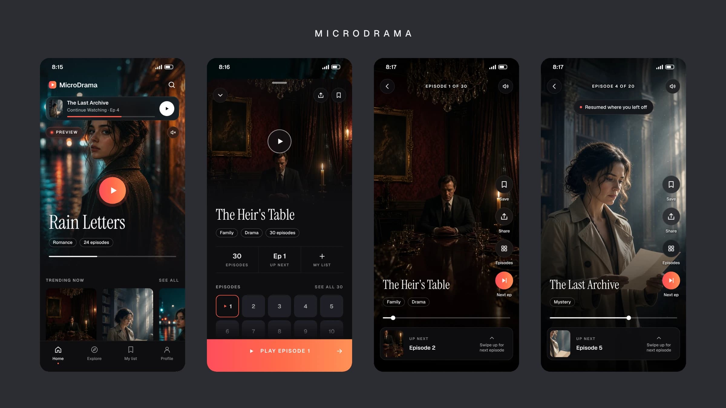
4 Core Mobile Surfaces
The product experience is built around four dedicated mobile surfaces designed for fast-paced consumer engagement:
Personalized Home
Problem: Users face initial discovery friction when opening a mobile streaming app.
Design Decision: Surface a dynamic vertical feed featuring instant auto-play video clips the moment the app opens.
Drama Detail
Problem: Users need quick context before committing to multi-episode serials.
Design Decision: Clean, thumb-friendly modal with key tags, episode count, and prominent 'Play Episode 1'.
Episode Player
Problem: Traditional horizontal video players require turning phones, breaking short-burst mobile viewing habits.
Design Decision: Immersive 9:16 vertical full-screen player with single-swipe episode switching.
Continue Watching
Problem: Returning users lose their place in serialized short drama, leading to abandonment.
Design Decision: Prominent 1-tap resume bar pinned to the top of the home feed.
Mobile-First Product Experience
MicroDrama Mobile Interface
Viewing Flow Sequence
Mobile Ergonomics & Design Details
- 9:16 Full-Screen Canvas: Native vertical aspect ratio maximizing screen real estate for modern smartphones.
- Single-Thumb Navigation: Primary controls (play, save, share, next episode) placed within natural thumb reach zones.
- High-Contrast Overlays: Crisp typography and semi-transparent gradients ensuring legibility over dynamic video content.
Peer Design Review & Prototype Evaluation
Concept Critique & Walkthrough Feedback
01 What Was Evaluated
Interactive Figma prototype walkthroughs testing auto-play discovery feeds, vertical swipe mechanics, and return-to-watch flows.
02 What Reviews Revealed
Auto-play previews noticeably reduced menu idling. Peer reviewers noted that 9:16 vertical playback felt natural for short-burst viewing.
03 What Changed After Critique
Promoted the “Continue Watching” resume bar to the top of the feed after reviewers struggled to relocate unfinished series in secondary menus.
Consumer Product Design Reflections
- Discovery Is a Product Problem: In consumer entertainment, how users find content is just as important as the content itself. Reducing decision friction builds product habit.
- Interaction Design Shapes Perceived Speed: Small interaction changes, like instant video previews vs. detail modal clicks, fundamentally change how fast an app feels.
- Mobile Constraints Require Radical Simplicity: On mobile screens, every extra tap or text block increases cognitive load. The best interfaces get out of the way and let the content carry the experience.
Previous Project
← Connected Service Operations Platform